DSC Annual NDIS Conference
Four years of conference identities for the people who make the NDIS work.
This is the story of a long-standing creative partnership with DSC, built over almost five years of designing identities for their annual NDIS conference. Each year brings a new direction, visually and thematically, as we work together to capture the evolving spirit of the event.
The conference plays a vital role in the NDIS community, connecting providers from across Australia and equipping them with practical, evidence-informed knowledge. Attendees leave feeling empowered to create real change in the sector.
Four editions, one partnership.
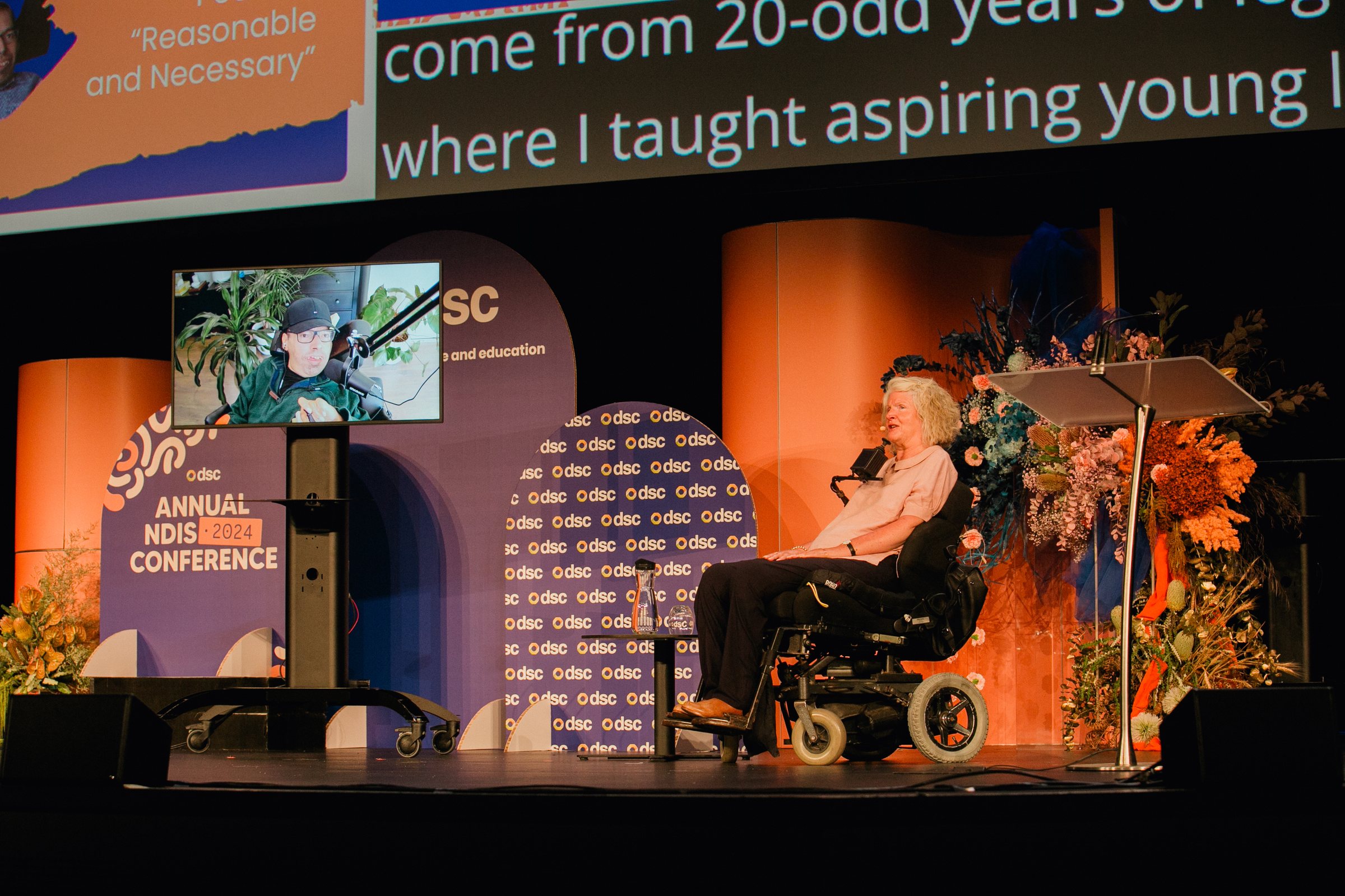
Every conference gets its own theme, palette and type, shaped by the city it lands in and the conversations the sector needs that year. Open a folder to see each edition.
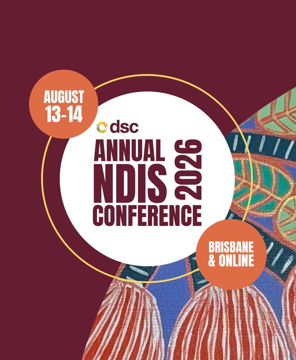
The conference moves to Brisbane. A deep plum palette and textured, hand-painted forms give the 2026 identity warmth and weight.
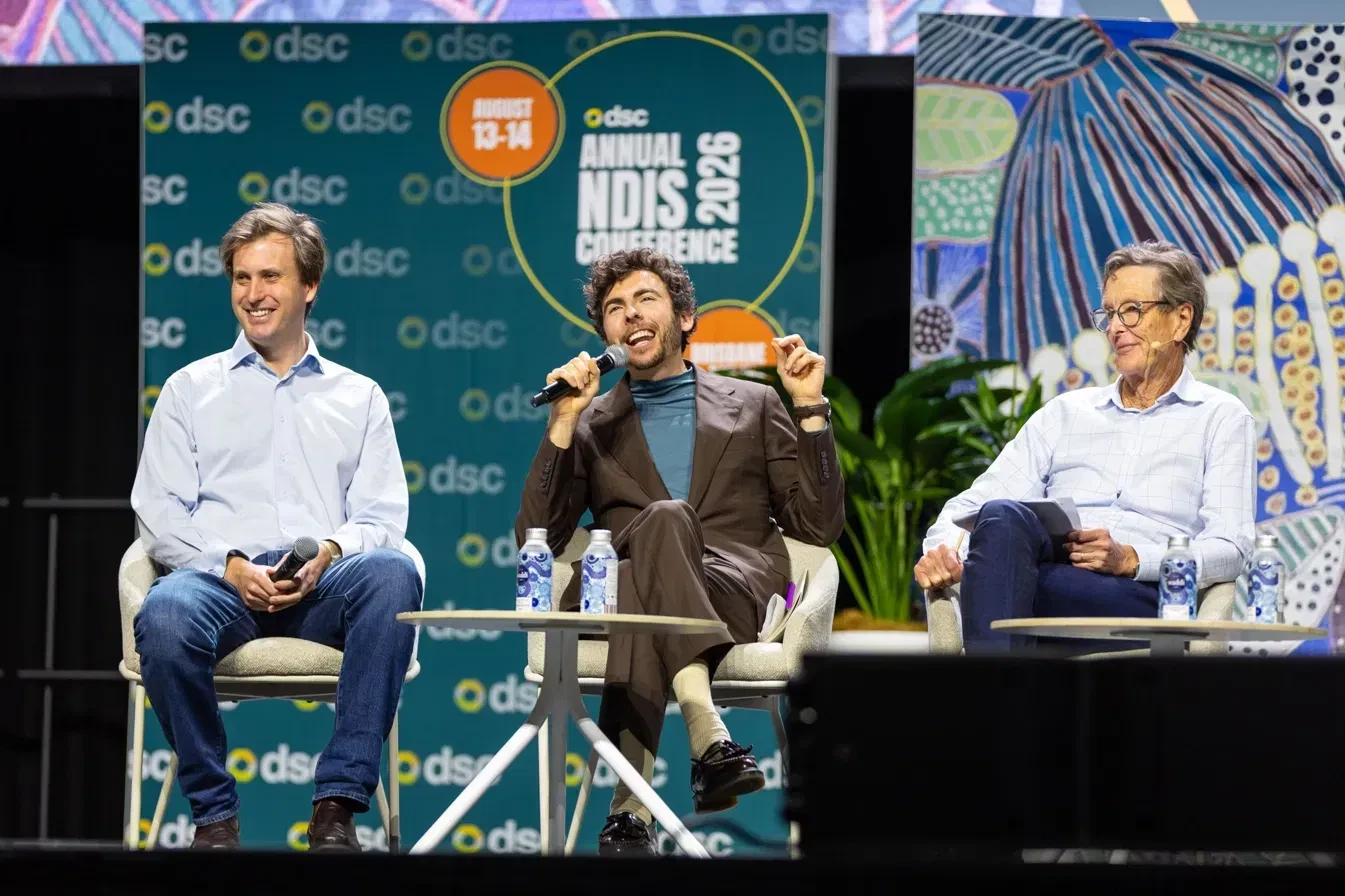
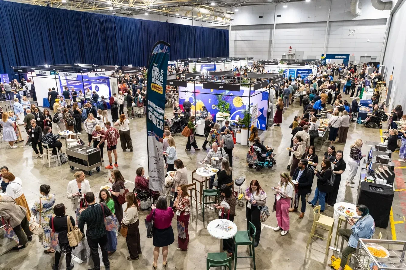
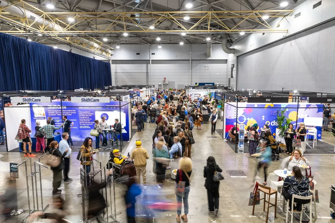
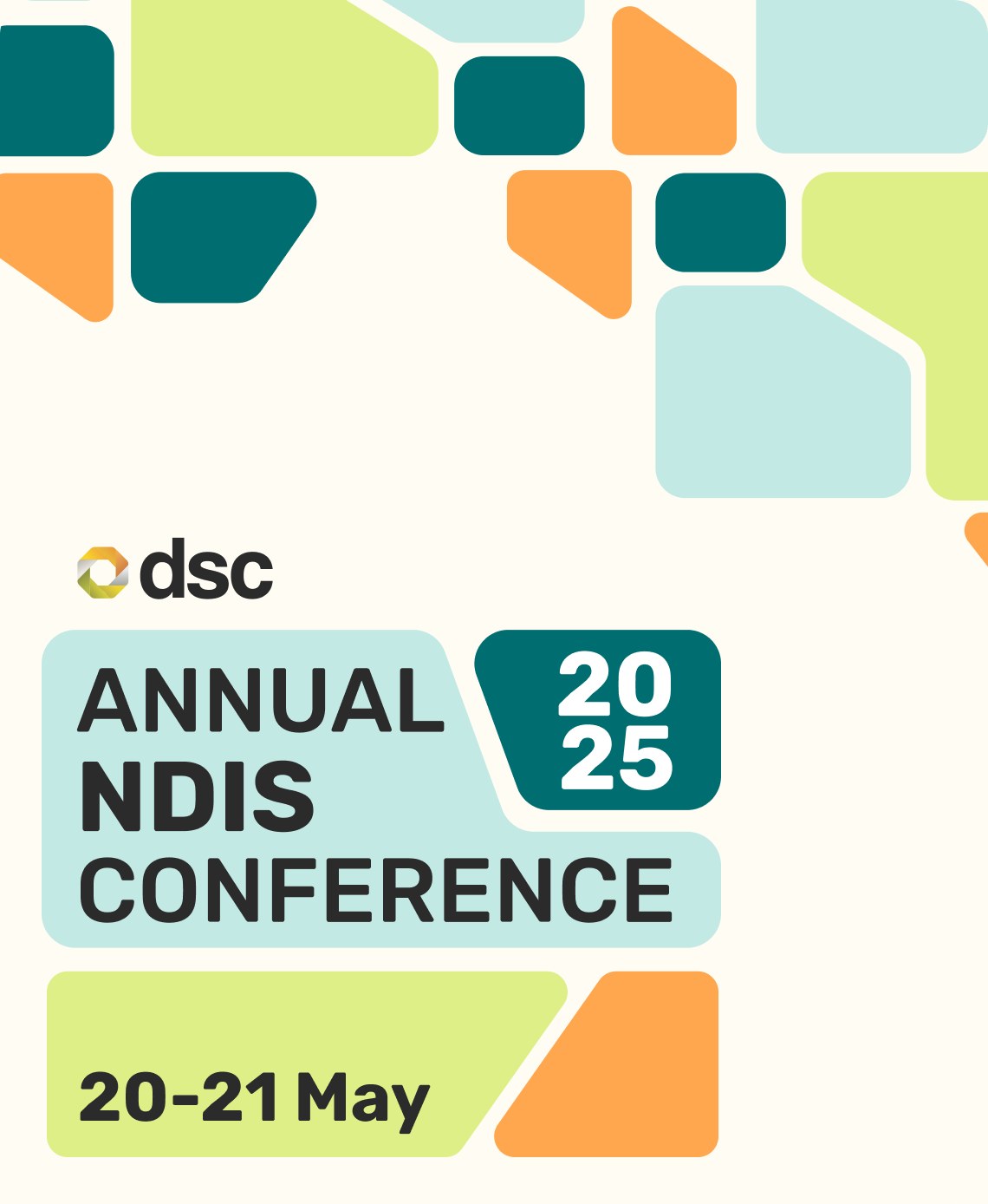
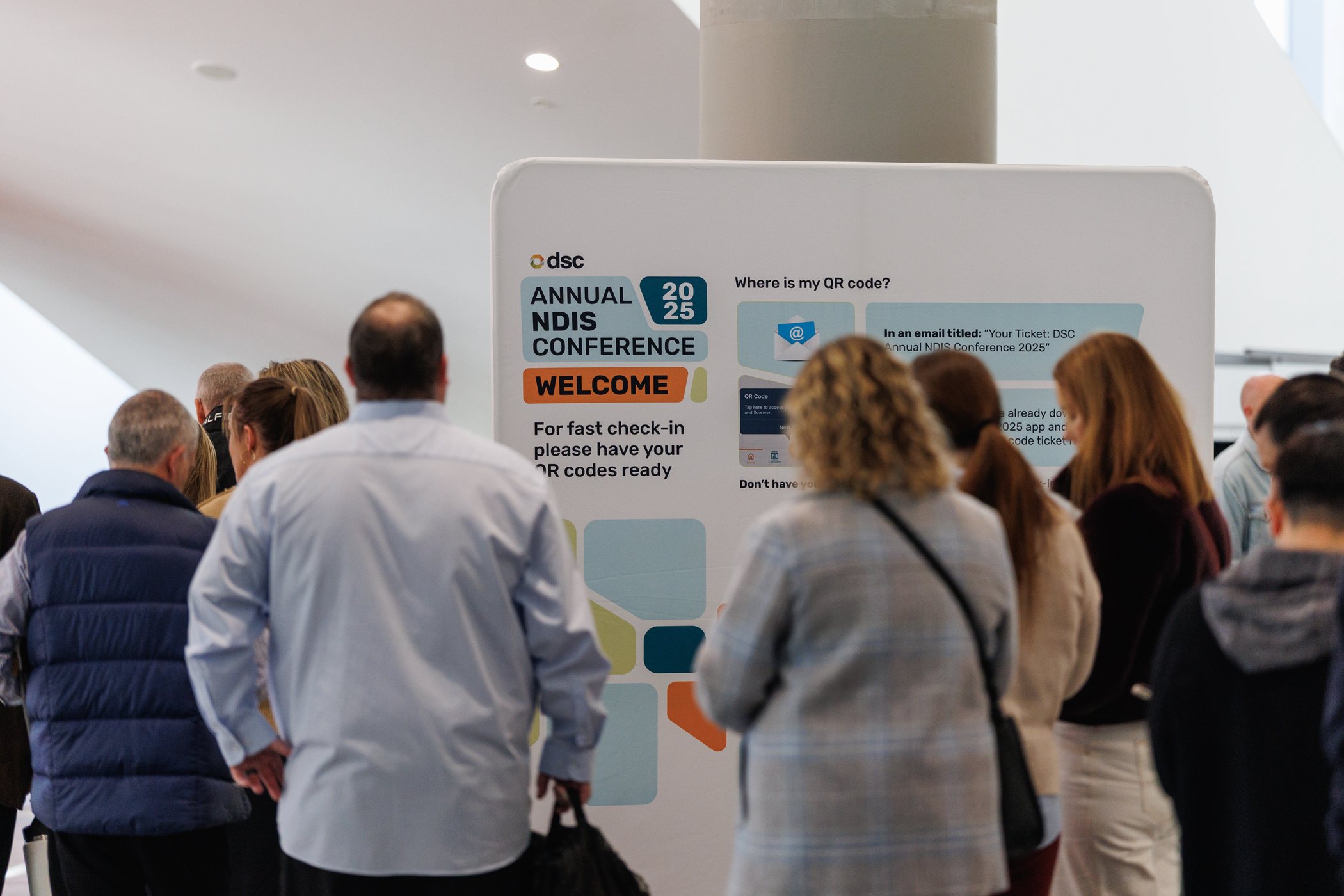
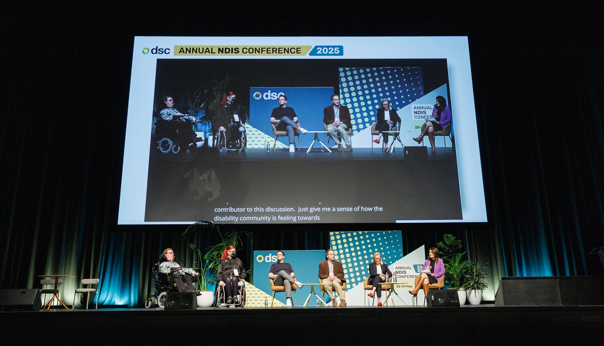
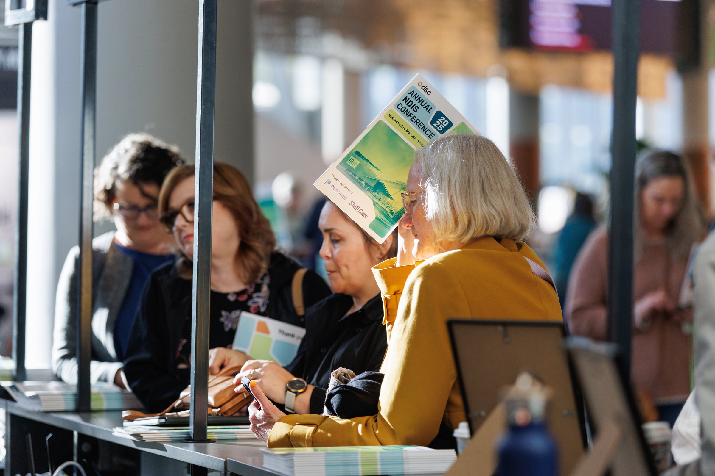
Modular shapes in teal, lime and orange built a system that could flex from welcome signs to stage screens. Large type and plain language made check-in calm and clear for everyone.
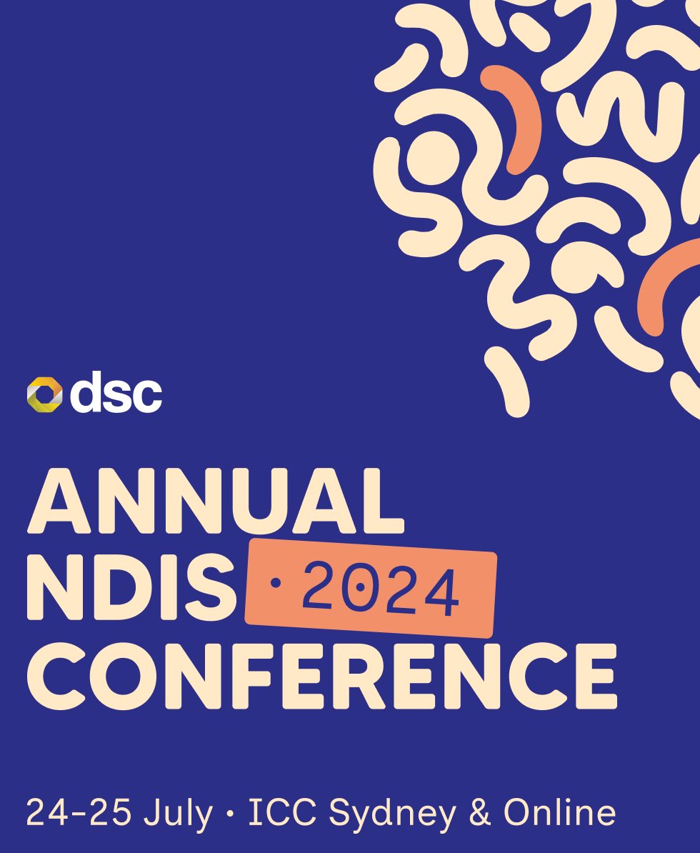
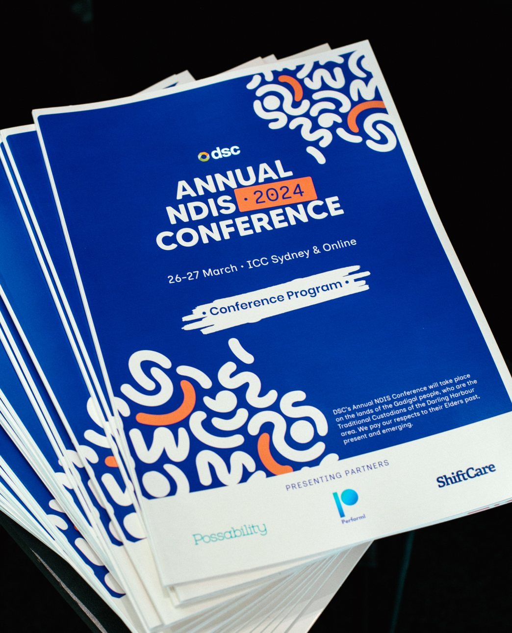
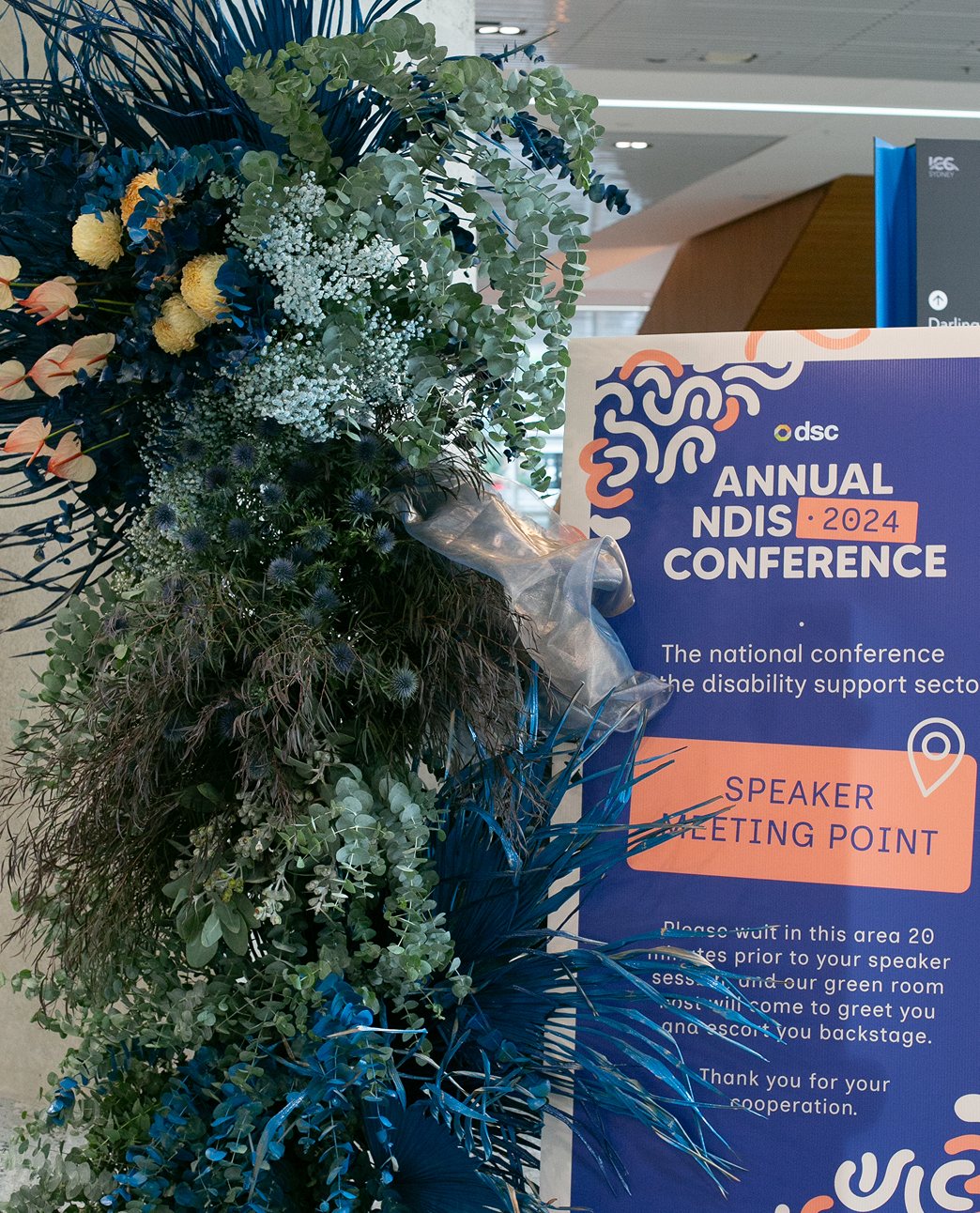
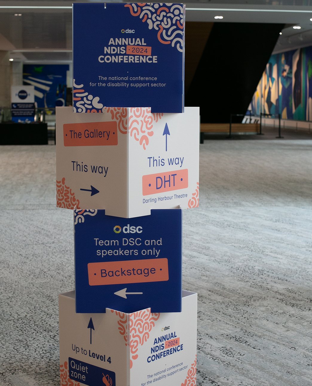
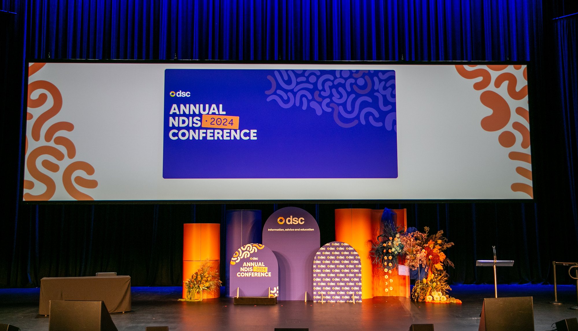
Playful hand-drawn forms in DSC blue and warm orange gave the 2024 edition its energy, from save-the-date to stage, program and signage.
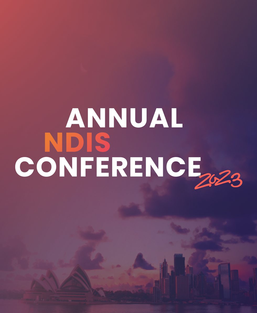
The first edition. A dusk view across Sydney set a warm, hopeful tone for a sector in change, with type that glows against the evening sky.
From identity to experience.
Each year, the work begins with a fresh identity: a logo, colour palette and typographic direction that sets the tone for everything that follows. From there, it grows into a full visual system: staging and props that shape the physical space, printed materials like sponsorship prospectuses, handbooks and wayfinding signage, and digital assets including promotional decks, social templates and on-screen visuals for the conference itself.
It’s a lot of moving parts, and getting them to feel cohesive is always the quiet challenge behind the scenes.
Accessibility isn’t an afterthought. It’s the starting point.
Working within the NDIS space, every colour choice, type size and layout decision is made knowing this work needs to reach people with a wide range of abilities. The goal is always materials that feel considered and inviting, never clinical, while making sure no one is left out.
It’s the kind of constraint that, honestly, makes the design better.
A partnership, not a project.
What’s made this work meaningful isn’t any single deliverable, it’s the continuity. Over four conferences there’s been a growing trust and shorthand that lets us push the identity further each year while staying true to what DSC stands for. Each edition builds on what came before, even as it charts its own visual course.
It’s the kind of collaboration I feel lucky to be part of.